Xun Zuo as a Brand
#Branding
#Print
#Advertisement
#Photography
Client:
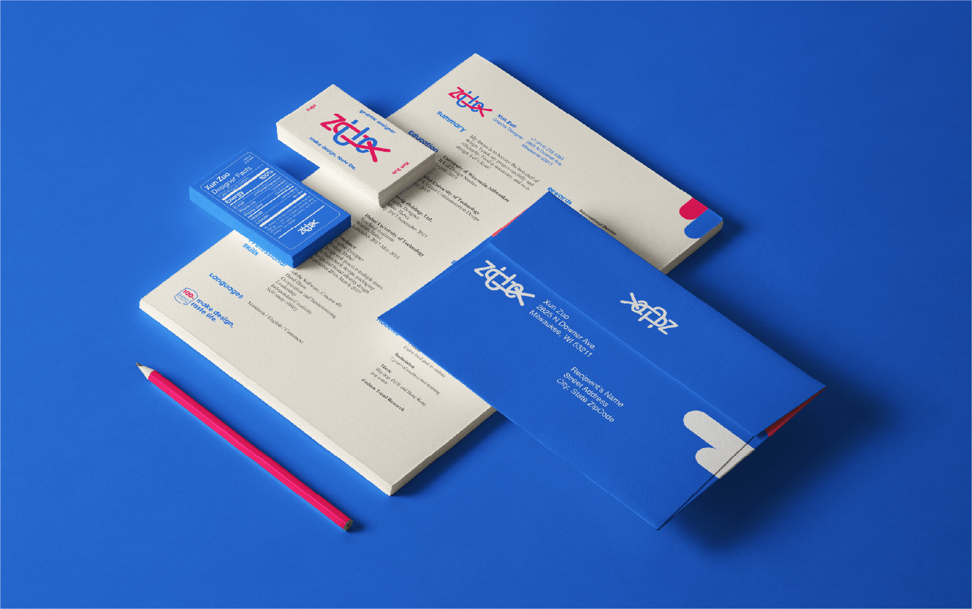
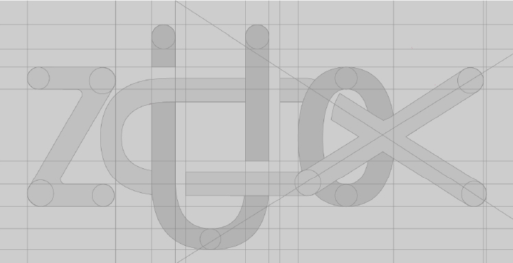
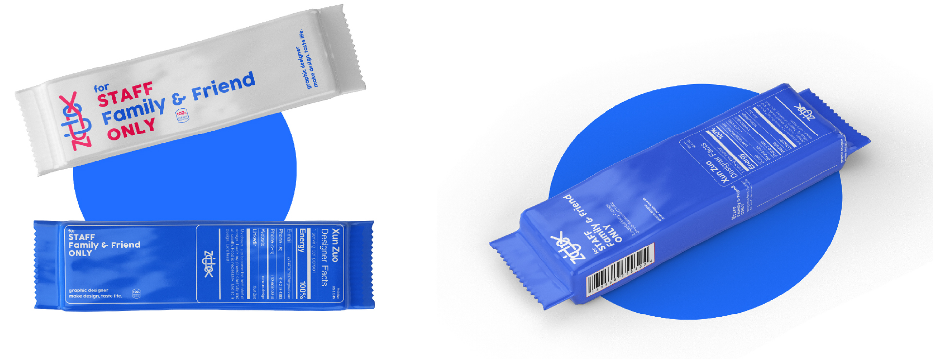
Xun Zuo is a branding design that focuses on myself and self-identification, designer and foodie are the keywords.
Design Solutions:
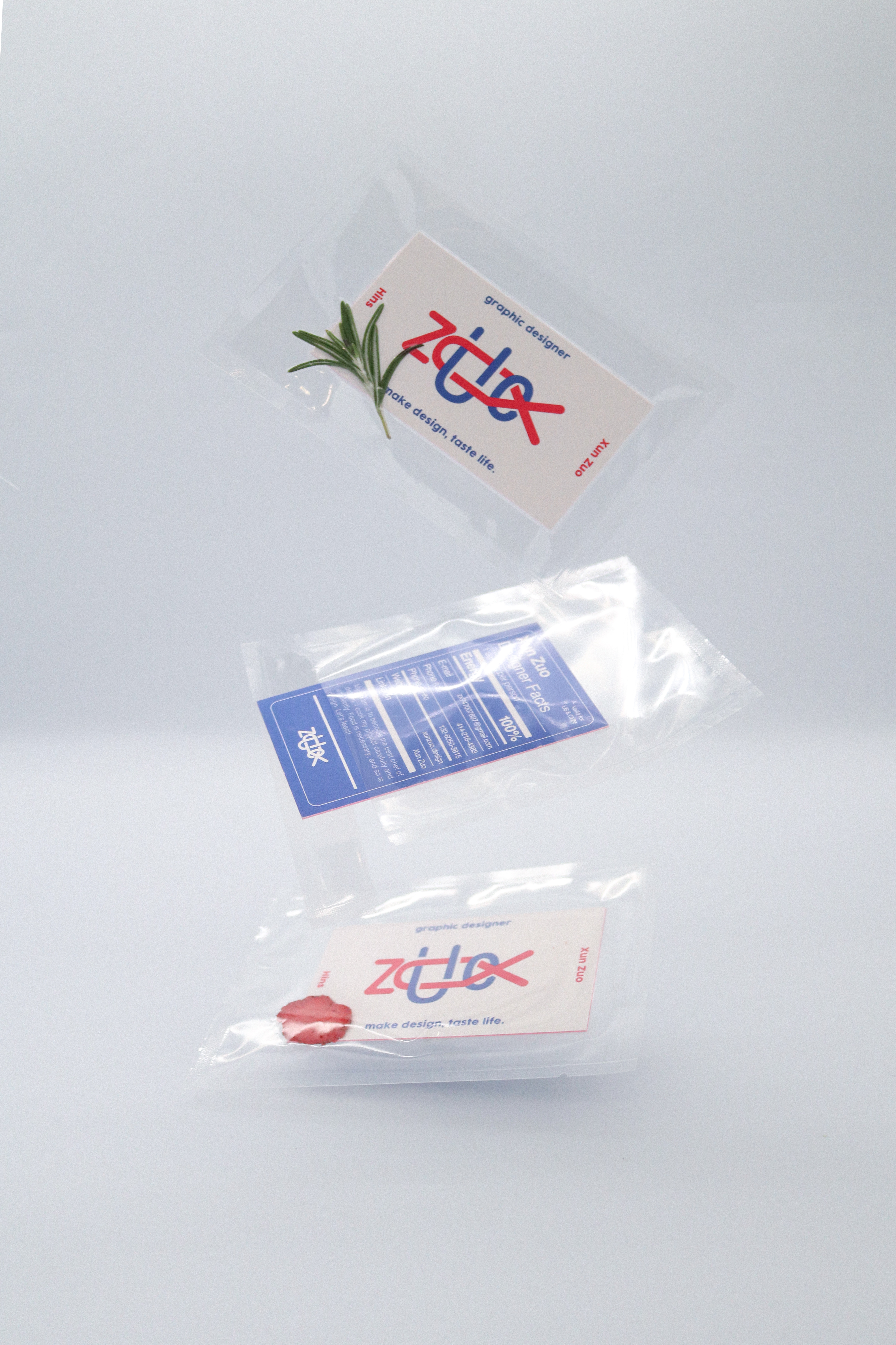
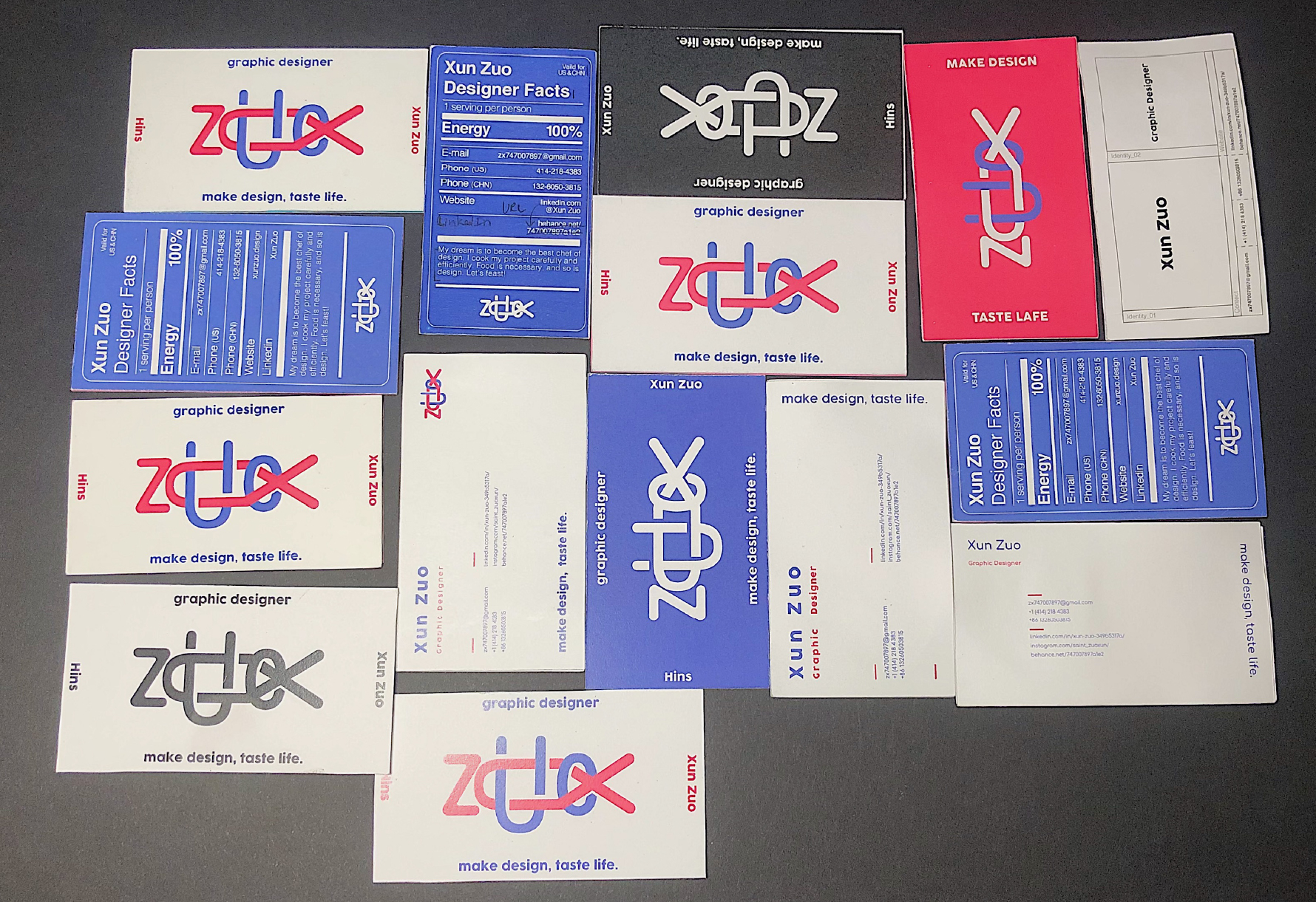
The connection between graphic design and cooking is evident as both involve elements of sensuality and rationality. This is reflected in the brand's font, which incorporates elements of fish, pasta, and other foods, while the red PANTONE 2040 C signifies passion and the blue PANTONE 2727 C represents logic. The business card further enhances the "design" and "gourmet" experience through a visual aspect inspired by a nutritional content label, evoking both the image of a gourmet and the identity of the designer. To appeal to the senses, the texture of sushi packaging, the aroma of rosemary, and the taste of frozen fruit were carefully considered and combined to create a unique synergy, with the message being delivered through a bucket of coffee, a cookie, or a box of dried fruit.
My role:
I led and undertook all aspects of the project from brainstorming, drafting, visualization to photography.
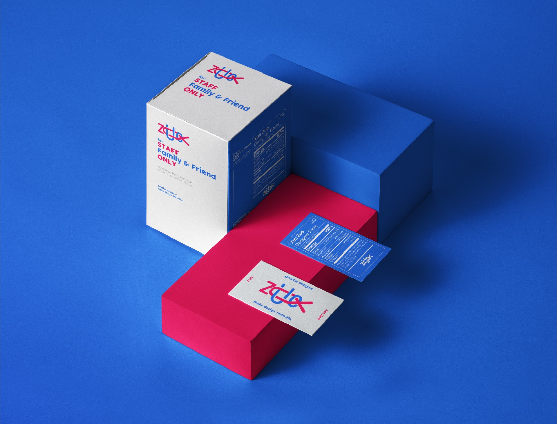
Xun Zuo is a branding design that focuses on myself and self-identification, designer and foodie are the keywords.
Design Solutions:
The connection between graphic design and cooking is evident as both involve elements of sensuality and rationality. This is reflected in the brand's font, which incorporates elements of fish, pasta, and other foods, while the red PANTONE 2040 C signifies passion and the blue PANTONE 2727 C represents logic. The business card further enhances the "design" and "gourmet" experience through a visual aspect inspired by a nutritional content label, evoking both the image of a gourmet and the identity of the designer. To appeal to the senses, the texture of sushi packaging, the aroma of rosemary, and the taste of frozen fruit were carefully considered and combined to create a unique synergy, with the message being delivered through a bucket of coffee, a cookie, or a box of dried fruit.
My role:
I led and undertook all aspects of the project from brainstorming, drafting, visualization to photography.


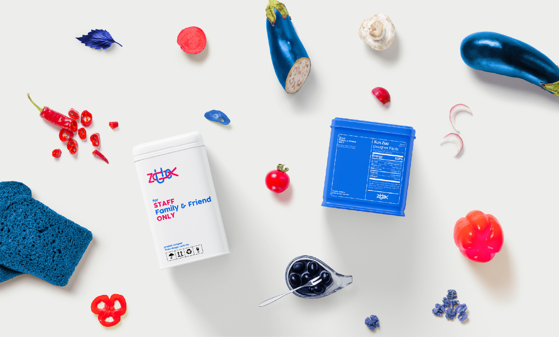
Design Solutions:
Continues the concept of the keywords, the advertising design matches the process of designing project and making food one by one. Through the production of salmon tartare, it shows my understanding of design and the process of my own design thinking. From the selection of ingredients to the presentation of the plate on the table, the designer has to be carefully selected at every step of the process.
Continues the concept of the keywords, the advertising design matches the process of designing project and making food one by one. Through the production of salmon tartare, it shows my understanding of design and the process of my own design thinking. From the selection of ingredients to the presentation of the plate on the table, the designer has to be carefully selected at every step of the process.
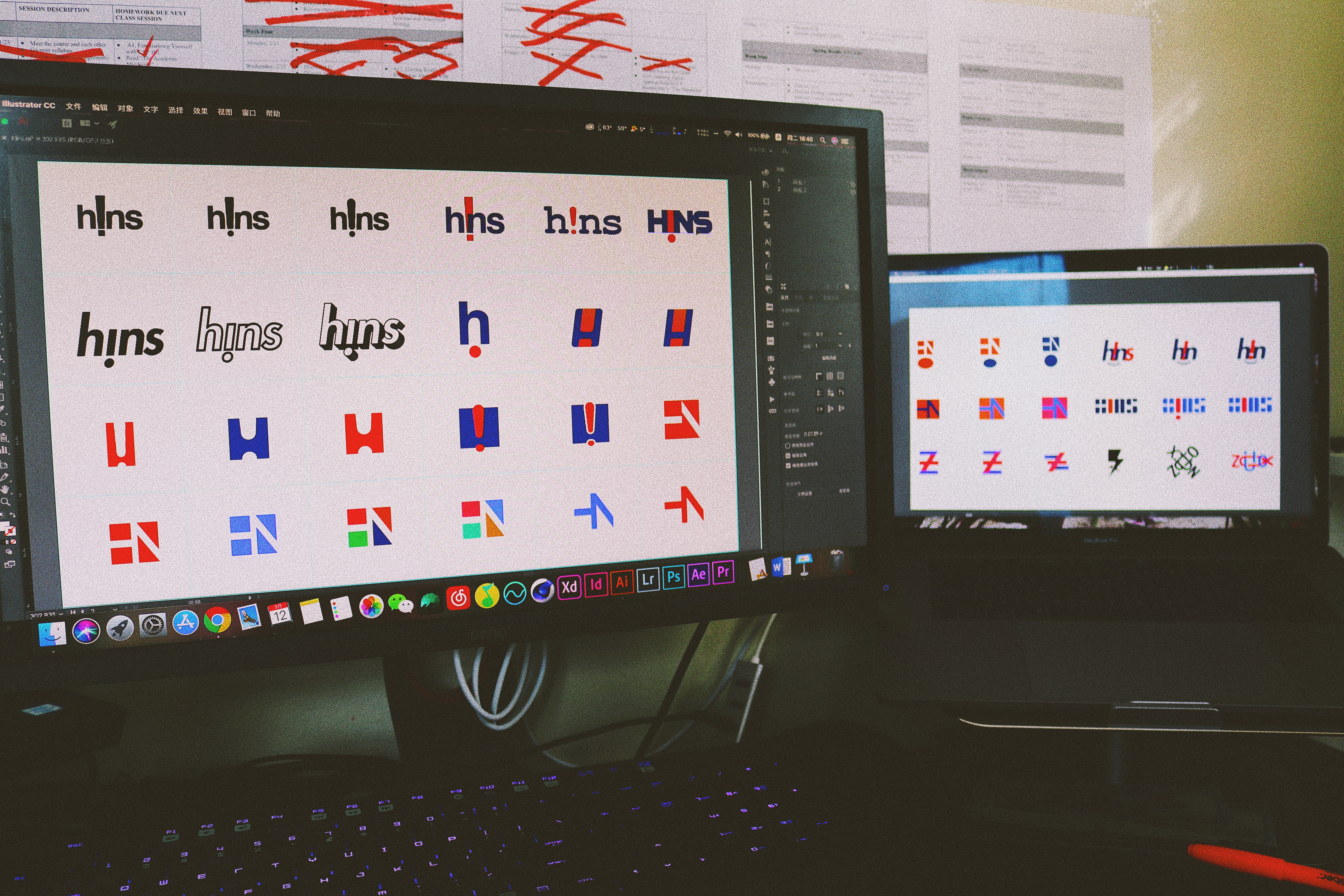

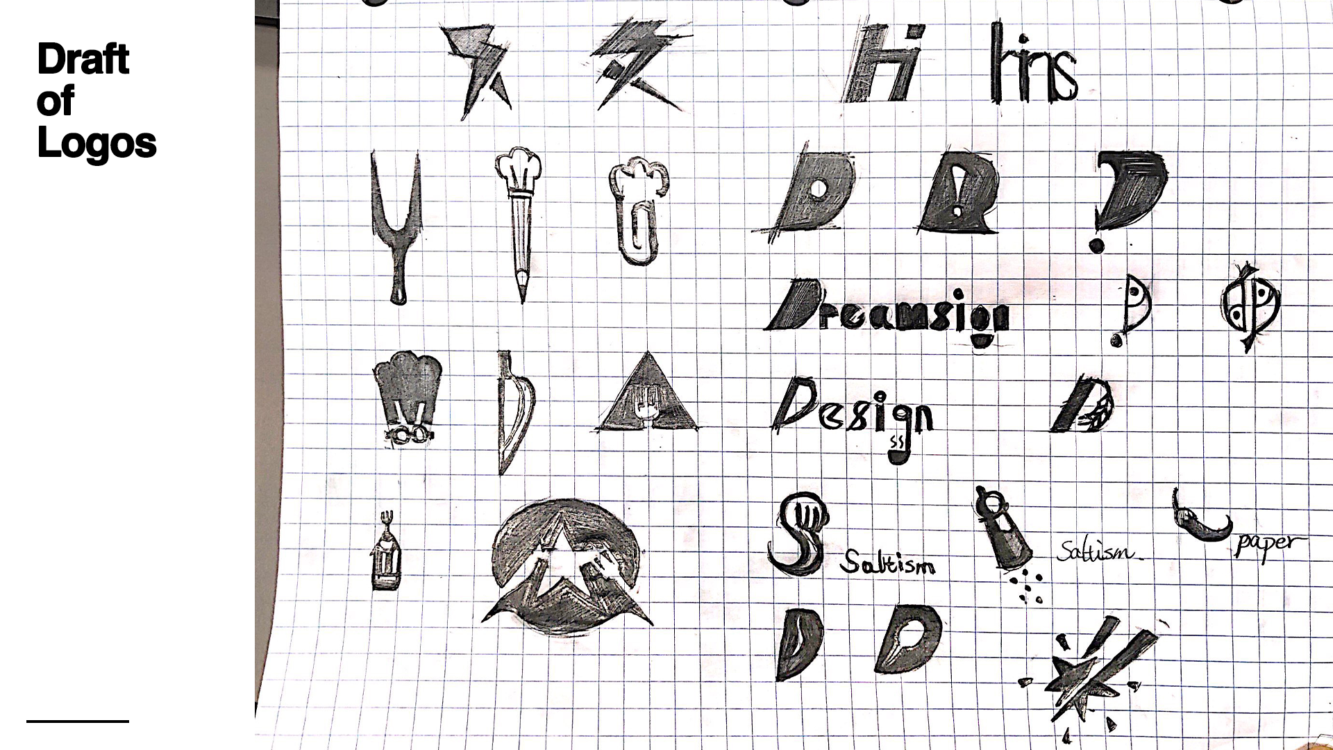
Drafts:
Sketches and drafts of the logo and business cards show the iterative process of this project.
Sketches and drafts of the logo and business cards show the iterative process of this project.