Music Union
#Branding
#Booklet
#Marketing
#Advertisement
Client:
Music Union is a start-up, seeking to increase brand recognition. Its main selling point is to provide music listeners with a platform to share music genres, artists, concerts and personal emotions by creating a bulletin board-like system (BBS). The key words are empathy and emotionality. The users are usually young listeners of R&B, K-pop, hip-hop and pop music.
My role:
For this project, I designed a complete cross-media visual identity, from brand colors, fonts and logos to web pages and interactive posters.
Logo Design Solutions:
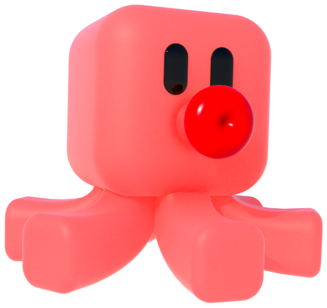
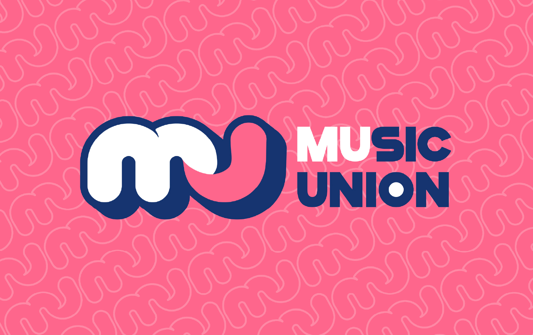
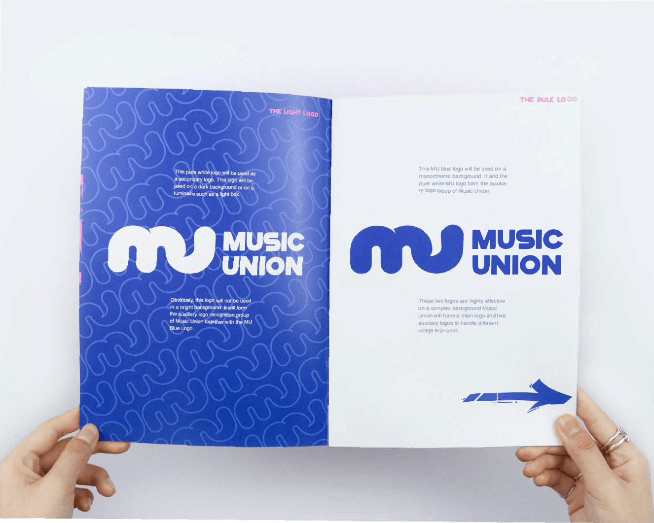
Unlike games, animation, or other forms of entertainment, the playing of music is often treated as a personal taste and preference, and the Music Union will break this inherent barrier, and make music a glue that aggregates people. The font design of the logo emphasizes the concept of gel-like adhesion, and the bright U symbolizes the outstanding people and fireworks in the music festival.
Music Union is a start-up, seeking to increase brand recognition. Its main selling point is to provide music listeners with a platform to share music genres, artists, concerts and personal emotions by creating a bulletin board-like system (BBS). The key words are empathy and emotionality. The users are usually young listeners of R&B, K-pop, hip-hop and pop music.
My role:
For this project, I designed a complete cross-media visual identity, from brand colors, fonts and logos to web pages and interactive posters.
Logo Design Solutions:
Unlike games, animation, or other forms of entertainment, the playing of music is often treated as a personal taste and preference, and the Music Union will break this inherent barrier, and make music a glue that aggregates people. The font design of the logo emphasizes the concept of gel-like adhesion, and the bright U symbolizes the outstanding people and fireworks in the music festival.
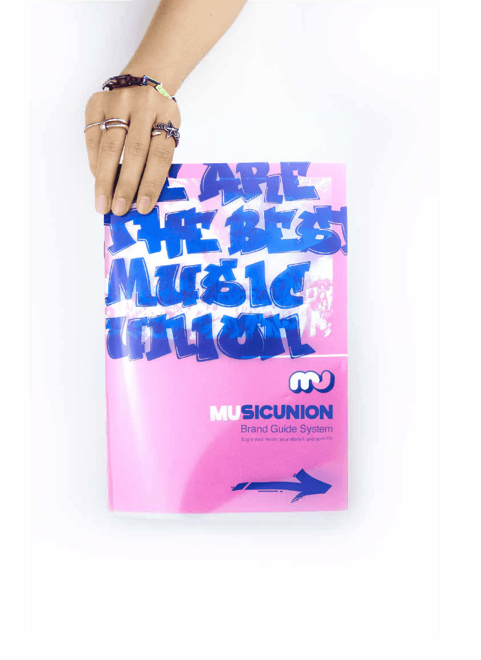
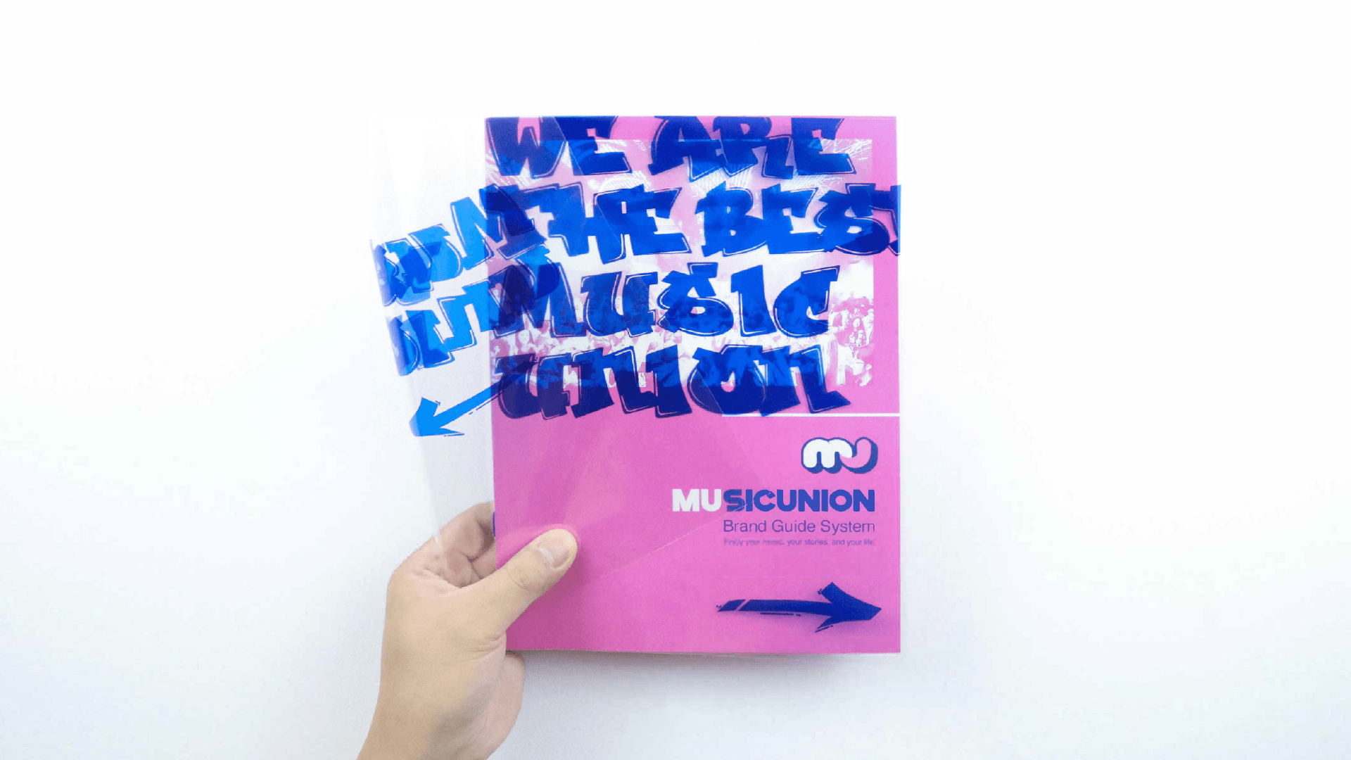
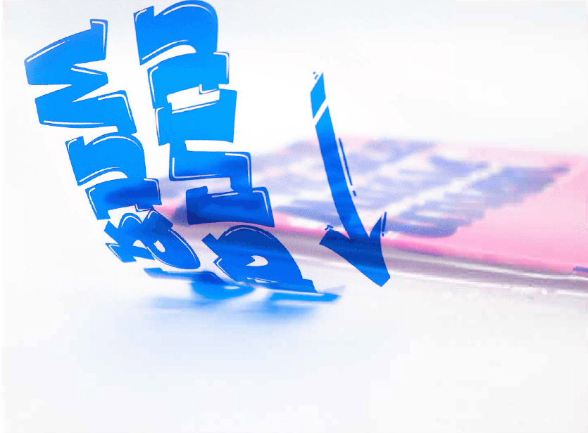
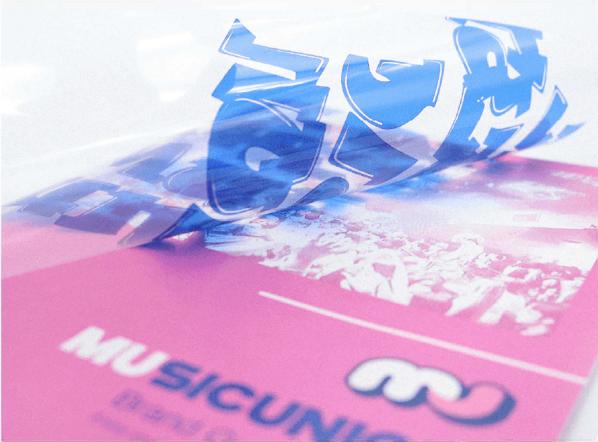
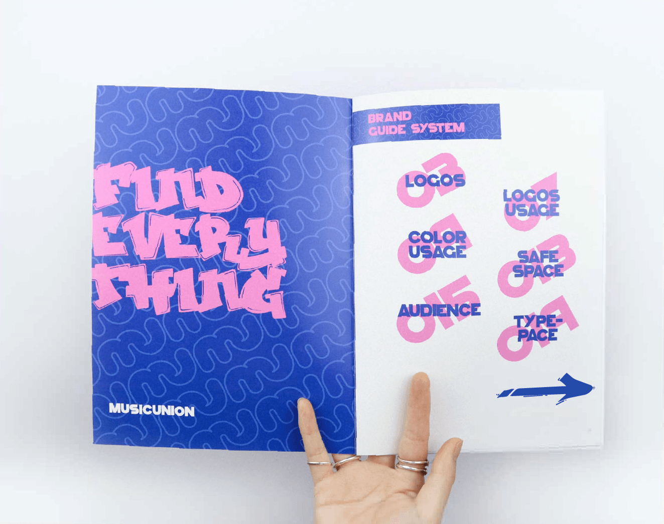
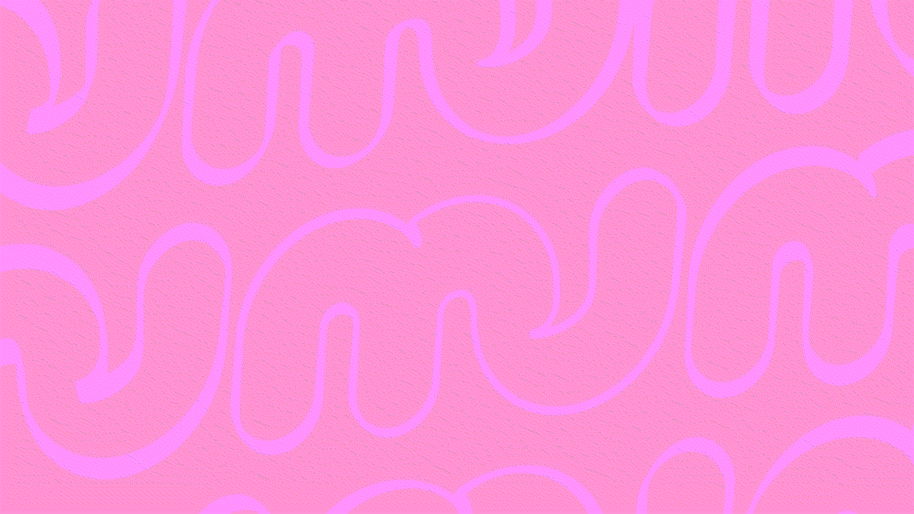
Branding Guidebook Design Solutions:
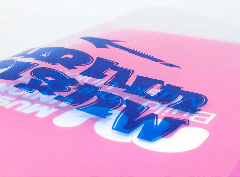
The music union is a young community with street culture, so in the cover design of the guidebook, graffiti fonts are used to express the orientation of youth and the street. The transparent cover is like a door and window glass. I hope you open it as if it is your home’s door to this magical community.
The music union is a young community with street culture, so in the cover design of the guidebook, graffiti fonts are used to express the orientation of youth and the street. The transparent cover is like a door and window glass. I hope you open it as if it is your home’s door to this magical community.
Advertisement Design:
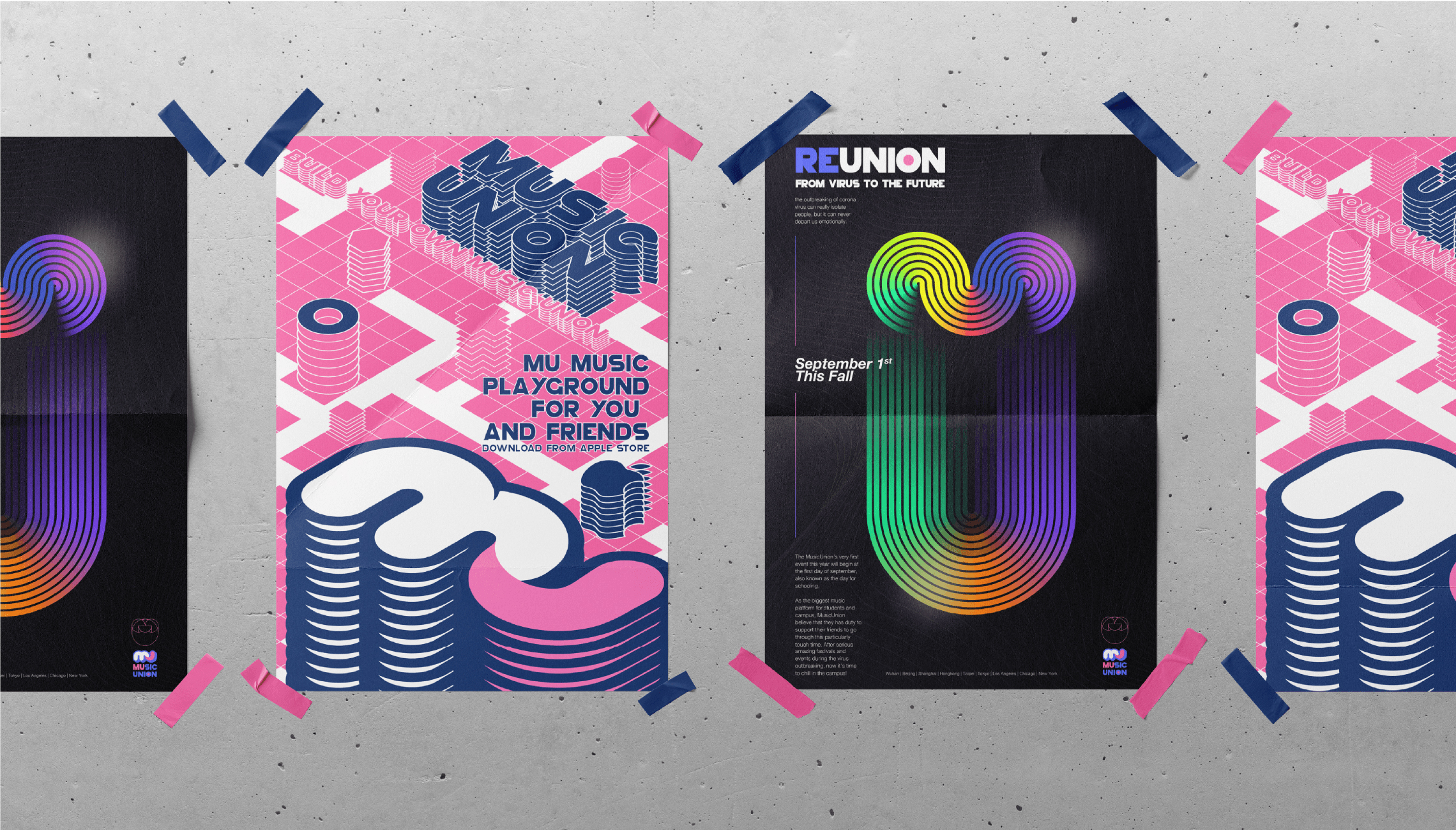
In the advertising design, a small number of music scenes are dynamically edited together with a large number of music union brand logos. The typeface of the MU is magnified to express street graffiti, arrayed and discolored to express the ribbons of the concert scene, and moved to express the motion of the music.
In the advertising design, a small number of music scenes are dynamically edited together with a large number of music union brand logos. The typeface of the MU is magnified to express street graffiti, arrayed and discolored to express the ribbons of the concert scene, and moved to express the motion of the music.